
Align icons vertically to the center of the first line of text
I ran into an issue while implementing customisable text sizes into a UI. I had a Callout component which consists of a box containing an icon and a block of text – a layout similar to this: This component was built a few years ago and designed so the icon perfectly centered on the first […]
Dynamic transparent color based on text color
Here is a small CSS snippet to calculate a transparent version of the current text color. This is useful in a themeable component system where semi-transparent elements like dividers, icons or backgrounds need to adapt to the surrounding text color. We can use the new color-mix function, which is now supported in all browsers, along […]
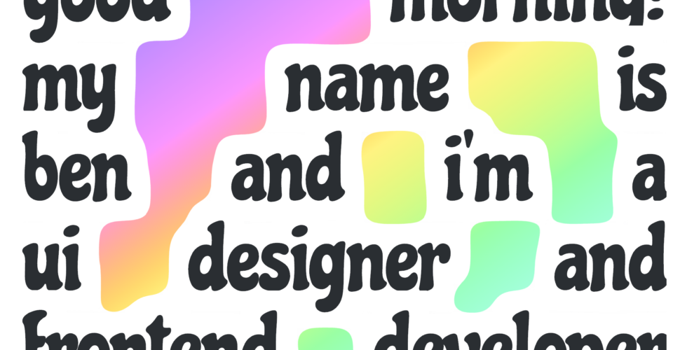
Gradient text gaps with CSS
I was reading an article recently that had some really nice graphic design examples. One piece that stood out was a poster that had a continuous gradient that filled the gaps between words in a block a text. I wondered if it could be achieved dynamically in CSS. Below is my result. Note that this […]
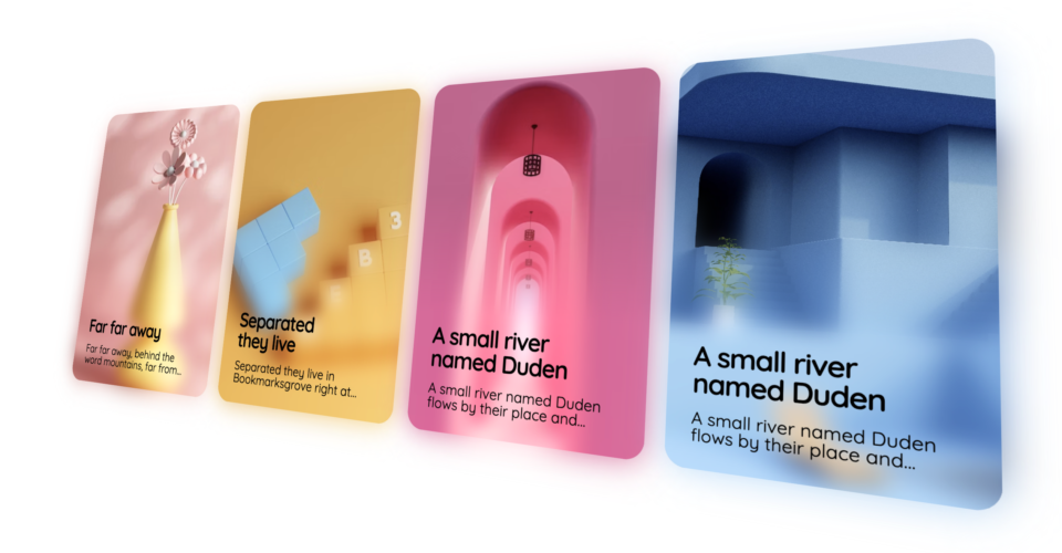
Blur gradient with CSS
The other day I came across a design on Layers that used a blur fade over an image as a backdrop for text in a card. It reminded me of a similar thing I attempted a couple years ago in CSS but wasn’t able to get working. I decided to have another go at it […]

Using SVG paths with CSS clip-path
If you have ever tried to use an SVG path for a CSS clip-path you would have likely ran into the issue where the SVG path doesn’t correctly scale and fill the DOM element to clip it.
How the latest version of Chrome broke my gradient editor
I recently discovered a strange issue where inserting colour stops in gradients with my colour picker was not inserting the correct color. It was slightly off, a bit darker than what was expected. I knew Chrome has recently released support for new colour spaces, could this be causing the problem? Turns out, yes. The same […]
Recreating the Apple Watch UI using a hexagonal grid
Building on the hexagonal grid from earlier, I have added a little JavaScript and have created an effect similar to the Apple Watch home screen UI. Below is a video of it in action, I am using IE11 (metro version) on a Surface Pro 2 which I found to be the most performant for this […]
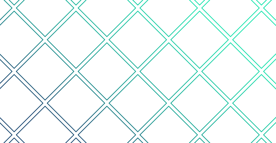
CSS Diamond grid
Following on from the last post I decided to play a bit more with the hexagonal grid and created a diamond grid. It works similar to the last grid except it uses squares rotated 45 degrees, so it is basically a regular grid tipped on its side with even-odd number alternating rows. Here is a […]
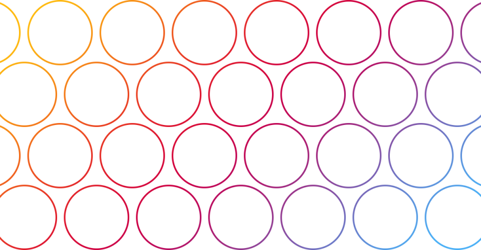
CSS Hexagonal packed grid
Most grids are square packed – that is each cell is stacked like a block which is great, but if you are after something slightly different maybe you should try a hexagonally packed grid. I will show you how to create a hexagonally packed grid using only CSS. But first, here is the difference between […]
A LESS mixin for a transition with a prefixed transition-property
The most common mixin you will find in LESS for CSS3 transitions is something like the following: The proplem with this is that if you want to transition a property that requires a prefix such as transform: You will end up with: This is not what you want, you need to have the transition-property prefixed […]