 Ben Foster
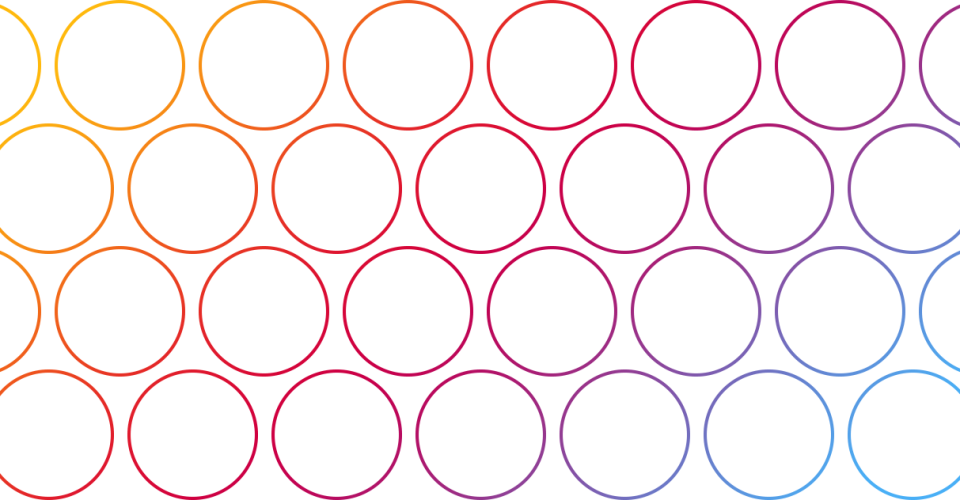
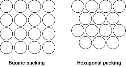
Most grids are square packed – that is each cell is stacked like a block which is great, but if you are after something slightly different maybe you should try a hexagonally packed grid. I will show you how to create a hexagonally packed grid using only CSS. But first, here is the difference between a square and a hexagonal packed grid:
To begin we’ll start off with some simple HTML – a container div and some grid items:
<div class="grid">
<div class="grid-item"> </div>
<div class="grid-item"> </div>
<div class="grid-item"> </div>
<div class="grid-item"> </div>
<div class="grid-item"> </div>
<div class="grid-item"> </div>
<div class="grid-item"> </div>
<div class="grid-item"> </div>
</div>Now we need to apply some CSS styling. First well a style the container .grid so that it has a max width and a background colour to easily visualise:
.grid {
  width: 100%;
  max-width: 900px;
  margin: 0 auto;
  background: #CCC;
}
Since each grid item will be floated left we will need to make sure that the floats are cleared at the end so the container fills the height of the entire grid. We’ll do this using the pseudo ::after element:
.grid::after {
content: "";
display: block;
clear: both;
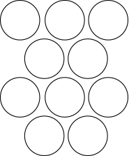
}Next we need to style the grid items. This example will use a grid with alternating rows of 3 and 2 like this:
Each item will be a third of the container width, minus 1% margin on the left and right. So the width will be 31.333%. I have also added -4% margin on the top (trail and error) so that the circles will “interlock”.
.grid-item {
  width: 31.333%;
  padding-bottom: 31.333%;
  overflow: hidden;
  float: left;
  background: #BBB;
  border-radius: 50%;
  margin: 1%;
  margin-top: -4%;
}
The top row doesn’t need to be moved up to interlock so for the first three items we’ll put the margin back to 1% using the nth-child selector:
.grid-item:nth-child(1),
.grid-item:nth-child(2),
.grid-item:nth-child(3) {
  margin-top: 1%;
}
Now we have to make every second row only contain 2 items, which are centered under the previous 3. This can be achieved using the nth-child An+B selectors. To work out which elements to target we need to divide the grid into groups of 5 items and push the 4th item in each group inwards:
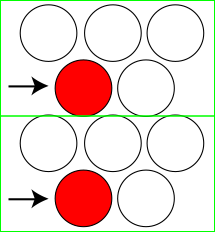
That can be done using :nth-child(5n+4):
.grid-item:nth-child(5n+4) {
  margin-left: 17.66667%;
}
Then we need to make sure the first item in each group starts a new line (but not the first item in the grid). This can be done using :nth-child(5n+6). This will divide the items into groups of 5 and select the 6th item, which will the the first item of the next group – therefor excluding the very first item in the grid:
.grid-item:nth-child(5n+6) {
  clear:left;
}
The final little extra thing to do – which is a nicety rather than a necessity – is the centre the last item if the last group of 5 only contains 1 item:
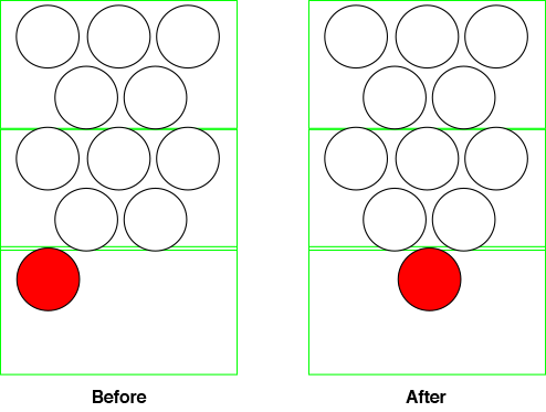
By checking if the item is the first in a group, and is the last of its type in the container, we can determine that it is a single element in the last row, and then centre it:
.grid-item:nth-child(5n+6):last-of-type {
  margin-left: 34.334%;
}
And that’s all there is to it. You can see the full CSS below.
.grid {
  width: 100%;
  max-width: 900px;
  margin: 0 auto;
  background: #CCC;
}

.grid::after {
  content: "";
  display: block;
  clear: both;
}

.grid-item {
  width: 31.333%;
  padding-bottom: 31.333%;
  overflow: hidden;
  float: left;
  background: #BBB;
  border-radius: 50%;
  margin: 1%;
  margin-top: -4%;
}

.grid-item:nth-child(1),
.grid-item:nth-child(2),
.grid-item:nth-child(3) {
  margin-top: 1%;
}

.grid-item:nth-child(5n+4) {
  margin-left: 17.66667%;
}

.grid-item:nth-child(5n+6) {
  clear:left;
}

.grid-item:nth-child(5n+6):last-of-type {
  margin-left: 34.334%;
}

.grid-item:hover {
  background: #FFF;
}
You must be logged in to post a comment.