Interesting finds on the new ABC News website
This week the Australian broadcaster ABC released the new branding for their News broadcast graphics and News website. Whenever a site I’m familliar gets updated, the first thing I do is inspect it with the browser dev tools to see what technology and techniques they have used. I thought I’d write down some of the […]
Overfit and Eigensolutions
Overfitting is a term used to describe building products or features that are far too specifc to a use case and don’t allow flexibilty for new or unexpected use cases. It doesn’t apply to all types of apps, but it’s particularly important for creative tools. I have been building creative tools for over 10 years […]
Pragmatic Drag and Drop, the ultimate drag and drop library?
Ever since I started using React I have used react-dnd for any drag and drop interactions. It is super flexible and allows for handling files and drag across windows since it used the browser’s drag and drop API. For some reason, I never really clicked with the API and for me it never felt easy […]
Simple tips to improve your UI design
The following are some tips I have found to be most impactful when either designing new, or cleaning up and modernising a user interface. These aren’t hard rules, I find that what ‘feels right’ can often better than sticking to rigid rules or systems, but these are a good guide. 1. Reduce borders The more […]
Align icons vertically to the center of the first line of text
I ran into an issue while implementing customisable text sizes into a UI. I had a Callout component which consists of a box containing an icon and a block of text – a layout similar to this: This component was built a few years ago and designed so the icon perfectly centered on the first […]
Building a wide-gamut colour picker
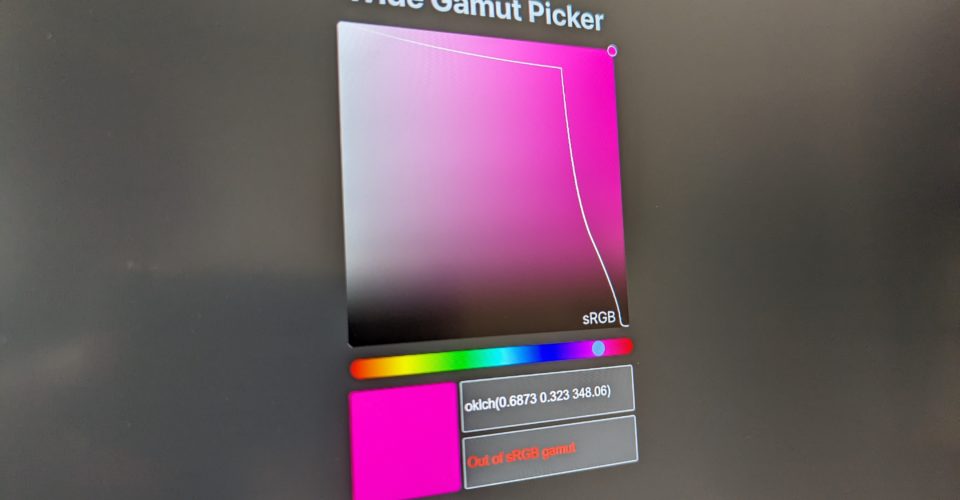
Now that browsers support wide-colour gamuts with P3, I have been wanting to build a colour picker that could select colours from outside the standard sRGB gamut. As the feature became more broadly available in browsers I’d seen a few examples popup from various people such as Gradient.style, the ColorJS.io picker demo, and OKLCH.com. However, […]
Nested corner radii
When designing a user interface with rounded corners you will likey run into situtation where you have nested rounded corners. It could be a button in a card or input, or a box inside a modal. What should the inner radius be? The easy way out is to just use the same radius, but it […]
Inspiring Inspiration #16
A collection of cool video, motion graphics and interface design.
Recreating the Apple Watch UI using a hexagonal grid
Building on the hexagonal grid from earlier, I have added a little JavaScript and have created an effect similar to the Apple Watch home screen UI. Below is a video of it in action, I am using IE11 (metro version) on a Surface Pro 2 which I found to be the most performant for this […]
CSS Diamond grid
Following on from the last post I decided to play a bit more with the hexagonal grid and created a diamond grid. It works similar to the last grid except it uses squares rotated 45 degrees, so it is basically a regular grid tipped on its side with even-odd number alternating rows. Here is a […]

